It's 2am in a village outside Gulu. Sarah is 32 weeks pregnant and her head has been pounding since dinner.
The nearest health centre is two hours away on a boda. She has a phone, one bar of signal, and a question she's a little embarrassed to ask.
Bulamu Bridge exists for that exact moment.
a composite of the stories the team hears. not one person, but not a rare one either.
Geography shouldn't decide survival.
A mother in rural Luwero deserves the same antenatal guidance as a mother in Kampala. But between her and that guidance sit four very ordinary walls:
Health information mostly arrives in English. Most questions don't.
The nearest clinic can be hours away, and a boda ride costs money.
Young people won't ask about contraception or HIV if someone might overhear.
One bar on a good day. Anything heavy simply doesn't load.
Bulamu Bridge AI's answer is not “an app”. It's careful AI paired with the people communities already trust: community health workers, nurses and midwives. That way a question asked at 2am in a home language can end at the right door by morning.
A front door for two very different visitors.
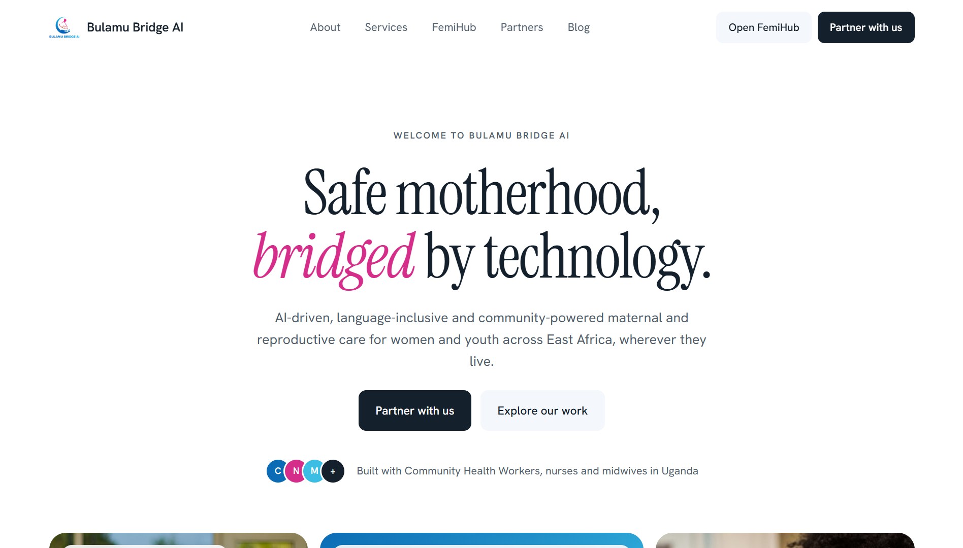
I designed and built the Bulamu Bridge AI website in Next.js. Its job sounds simple and isn't: explain a human, complicated service to a pregnant 19-year-old and to a donor deciding where to put a grant, without talking down to either.
The site grew into “one bridge, two ways in”. Here are the calls that shaped it:
- 01Two doors from the first screen
Mothers and young people get “Open FemiHub”. NGOs, clinics and donors get “Partner with us”. Nobody has to read the other audience's page to find their own.
- 02One word in italics, every headline
Safe motherhood, bridged by technology. Care that meets women where they are. The emphasis is the voice. It reads like a person leaning in, not a brochure.
- 03People, not hospitals
Nurses, midwives, mothers, community days in Gulu. The imagery says who is doing the work. The AI is there to help them, not replace them.
- 04Light enough for the last mile
The site has to explain the service to someone on a slow phone. So the pages stay lean and the story comes first.
The live site.
the first screen: one promise, and two doors
the mission, given a whole screen to breathe
Follow one question across the bridge.
pick a situation, then watch who gets involved and what they already know.
Oli otya! I'm Femi. Ask me anything, it stays between us.
Pick a situation below ↓
What happens behind the chat
nothing yet
An illustration of the care flow, written for this portfolio. Not medical advice, and not real patients.
Care designed for real life.
I'd do again
Writing the copy before designing the layout. Once the headlines sounded like a person, the page almost arranged itself.
I'd do differently
I'd test the site on a cheap phone on 2G from day one instead of week two. Every heavy image I cut later, I could have never added.
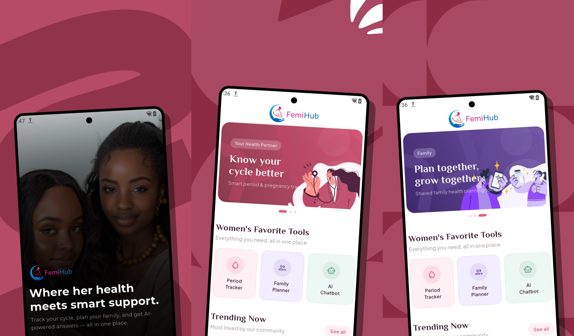
the website is the front door...
FemiHub is the room behind it. Read chapter 03 →